Introducing a new brand identity for Cubos.
Cubos had grown out of its cocoon and needed new wings to fly out of its embryonic phase. The new visual identity aimed at providing a more cohesive and professional look to an increasingly defined and completed game engine. A new logo was designed, alongside a set of visual rules and principals that form Cubos new identity.
The process started with the logo. The team wished to keep the 3D aspect of the former logo, but with a more slick and modern twist. Furthermore, as the project was aimed at a software (a game engine), an icon was necessary for the application, the branding the launch screen, etc. A stylized wordmark, like the previous version, was insufficient. So we set to design the icon. At first, the design followed a more intellectual and less literal approach, adapting an isometric view with 3 sides to establish a deconstructed view of a Cube. The concept of this design was to incorporate the movement and change in the symbol, while representing the assembly purpose of a game engine. In this case, the assembly of a cube, with is faces at the moment they are sliding into place.
The team received this design with mixed feelings. The logo had little of the 3D aspect that made their previous logo and that also constitutes the main selling point of the engine - voxel base game engine. Therefore, we jumped to a second design, that retained the original while representing a shape made of literal isometric cubes. The final shape was a 3-armed spiral, inspired by the Keltic symbol the Trisquel, without copying the Trisquel GNU/Linux software.
Unfortunately, to some members of the team, the new icon reminded them of some unpleasant symbol. Consequently, we're back to square one. A brainstorming session ensued. Various shapes were tested and debated, but the icons kept getting too complex and unrecognizable.
Eventually, we arrived at an icon that was composed of cubes, that did not bring any bad connotations and that was relatively simple and memorable. As it can be seen in the experiment above, the spiral/movement idea was forsaken in favor of a greater emphasis in the assembly aspect. Three cubes merged to form something more complex, suggesting ideas of union and strength.
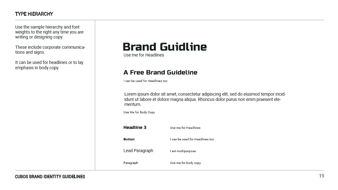
Parallel to the icon design process was the font selection. The goals we set at the start were that the font had to transmit a feel of modernity and a certain degree of formality, since those were the goals of this redesign, while conveying the slickness and dynamism of an innovative product. Other concerns that were considered were the versatility and rights of the chosen font. To address this last point, we opted for google fonts library, a largely integrated and open-source collection of great fonts, that complements the open-source aspect of the project. The fonts selected were Russo One for the logo mark and displays/headers, and Roboto font family for text body. Russo One conveys energy and strength while maintaining a dynamic feel to it, while Roboto is a well-established in the space of tech and innovation.
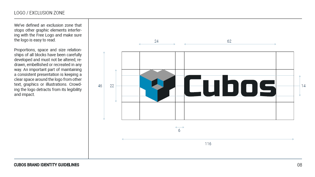
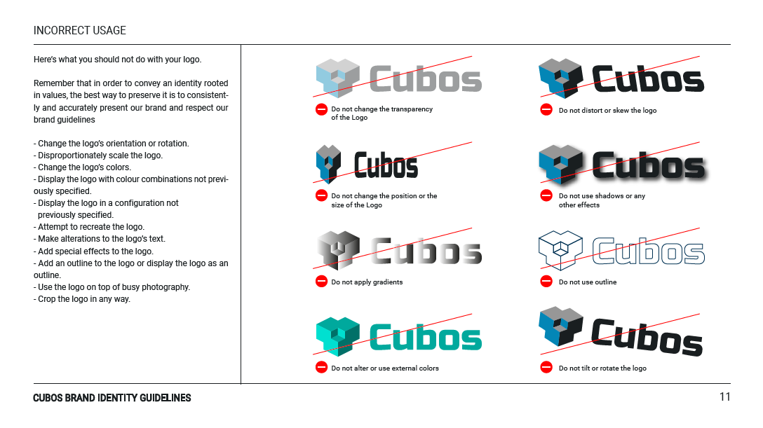
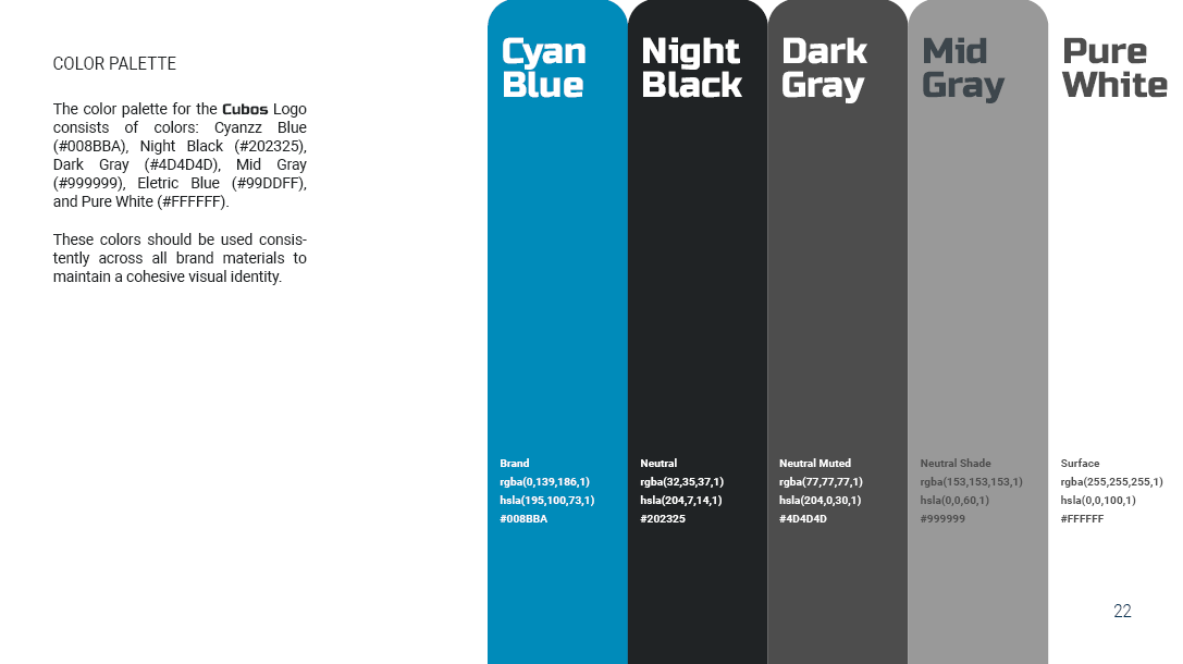
About the logo's colors, it can be observed that these remained virtually unchanged thought out the design process. The contrast of neutral colors with a cyan blue, that aim to represent knowledge and innovation, was well received. Additional colors were added to the pallet for software and marketing purposes. Speaking of which, a Brand Guidelines Document was enacted to specify how the brand and marketing material should be designed and to which principles it should adhere.

About the author
Nuno Baptista is a Multimedia Artist and Designer, graduated from the Faculty of Fine Arts of Lisbon. He is currently leading the Cubos Community team. You can learn more about his projects on his website.